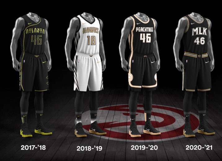
For Martin Luther King Day 2021, the Atlanta Hawks debuted their latest NBA City Edition jersey. It was a simple black uniform with the initials “MLK” emblazoned across the chest. Given the current state of social justice, coupled with the fact that Dr. King was a Georgia native the messaging was as tasteful, timely and effective.
It was also part of the latest line of the NBA’s and Nike’s widely popular collaboration of City Edition jerseys. A set of uniforms that have brought fans and teams together by evoking hometown pride for each the team and the fans. In short, the NBA and Nike are thinking globally, but acting locally. With the latest NBA season now in full swing. Nike offered an up-close look at the evolution of the jersey from its inception to the most current season. Each jersey has a story and a purpose. Check them out below.
ATLANTA HAWKS
As mentioned at the top, the Atlanta Hawks pay tribute to one of the city’s most iconic and revolutionary natives, Martin Luther King Jr. It’s not just about optics though. Proceeds from this jersey will support various economic empowerment programs for communities of color in Atlanta.
BROOKLYN NETS
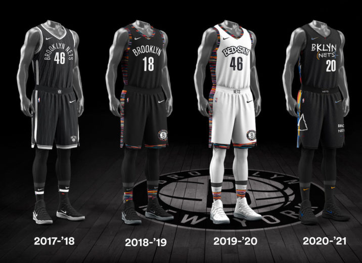
Last year it was Biggie Smalls. In 2021 fellow Brooklyn native Basquiat gets the City Edition treatment. The logo is stylized in the font and color palette made famous by graffiti artist whose work set the tone for 1970’s street art.
LOS ANGELES LAKERS
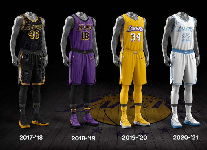
Past jerseys have honored fallen icons such as Kobe Bryant. For the 2020-21 season the Lakers keep the logo but change the color palette. Going way back in the day to the origins of the franchise in Minneapolis when the team donned a white and sky-blue color combination.
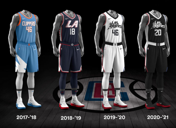
LOS ANGELES CLIPPERS
Cross town rival LA Clippers don’t stray too far from what they donned for 2019-20. Opting to go all black everything but maintain the latest iteration of their logo. Smart move for a franchise still looking to build its identity in the uniform and culture department.
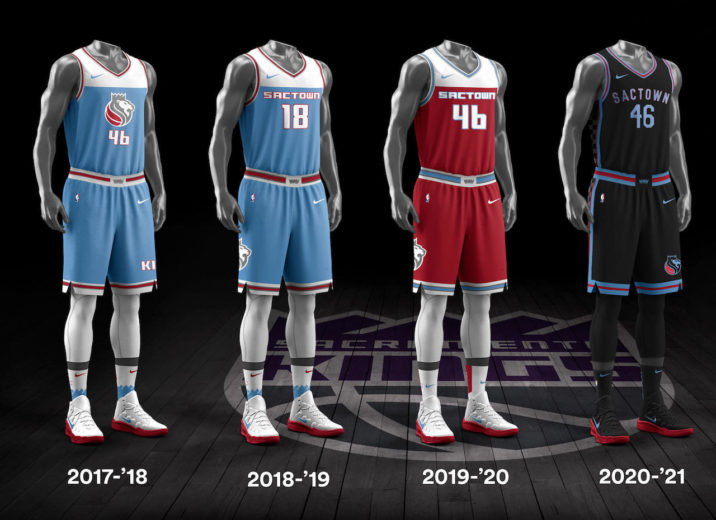
SACRAMENTO KINGS
Further north, the Sacramento Kings darken their jerseys this year. Departing from baby blue to black. While evoking the “SACTOWN” moniker.
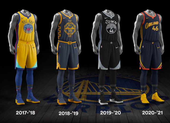
GOLDEN STATE WARRIORS
Even, further north, Golden State go back to a combo of its 90’s early 2000’s look while paying homage to their hometown roots with their Oakland Forever jerseys. These jerseys focus on the We Believe era that included a playoff run in 2007. That year the team as an eighth seed defeated the number one seeded Dallas Mavericks. Hoping the uniforms will inspire a repeat of play perhaps?
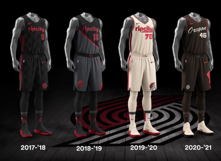
PORTLAND TRAILBLAZERS
Leaving behind the “Rip City” logo that has appeared since the first version of the jersey. This year Portland keeps it simple in terms of logo. Opting for straightforward “Oregon”. They get more creative on color combo. Lining the side of each jersey with a color guard that pays tribute to the tribal nations that have existed throughout the region.
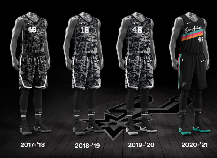
SAN ANTONIO SPURS
The Spurs throwback for 2020-21. Ditching the camo look of years past and returning the colors of the David Robinson era. These fiesta colors first appeared in1989 and lasted until their first championship in 1999. We are sure the Admiral would salute to these threads.
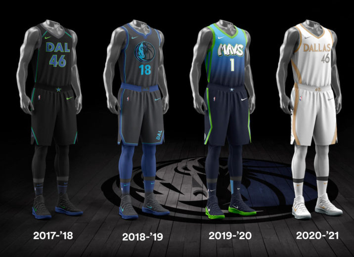
DALLAS MAVERICKS
Elsewhere in the Lone Star state the Dallas Mavericks make a drastic departure from jerseys of years past. Gone are the trademark colors of blue, grey and green. Replaced by all white with a silver and gold lettered logo. Subdued for Cuban and his crew.
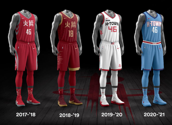
HOUSTON ROCKETS
Rounding out the Texas trinity are the Houston Rockets. Who also make a drastic departure from past jerseys. The Rockets go in a direction the Mavericks have a reputation for taking. The Rockets ditch the red and white and opt Columbia blue with red and white logo. The jersey is said to be a nod to their very own Houston Oilers, the old NFL team. The Rockets have “H-TOWN” across their chest, similar to what we saw on their city jerseys last season.
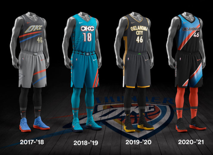
OKLAHOMA THUNDER
As a relatively young franchise the Thunder don’t have much in the way of history to lean on. This year’s jersey looks like a variation of the road jersey donned last year. Sleek and nice color combo, but like the Lakers, why not tap into those Seattle Supersonics roots? Could have made for some nice throwback nostalgia.
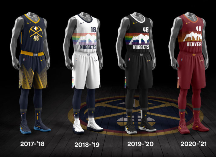
DENVER NUGGETS
Denver didn’t stray from prior versions of their jerseys. They keep the Rocky Mountain skyline design but leave behind the rainbow colors. Opting for crimson red.
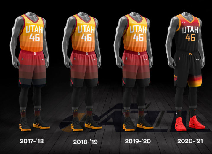
UTAH JAZZ
For 2020-21 Utah takes a more muted approach. They leave behind the bright color palette of yellow, deep red and orange and opt for a muted look. Primary black with colors on the edges.
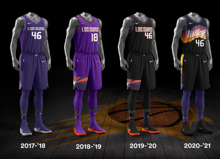
PHEONIX SUNS
The Suns make a big change in 20-21, leaving their traditional purple, orange and gold and opting for black. They also add the moniker “The Valley”. These jerseys are said to celebrate “The Valley” as its franchise’s home and the young core, the “Valley Boyz,” have built.
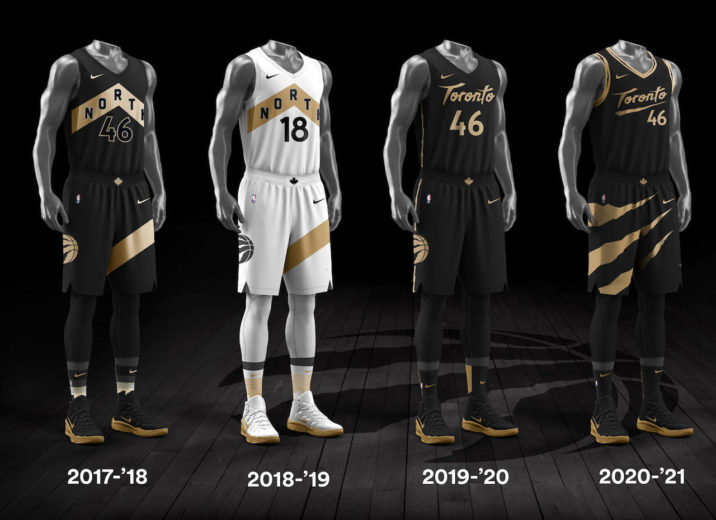
TORONTO RAPTORS
This year the Raptors abandon “The North” moniker which has come to give them identity in the NBA (they gotta give Game of Thrones some props for that). This year the Raptors return to their regional name. Simply placing “Toronto” in cursive across the jersey. A nice touch to the Raptor roots are the Raptor claws appearing on the shorts. Some clever design going on here.
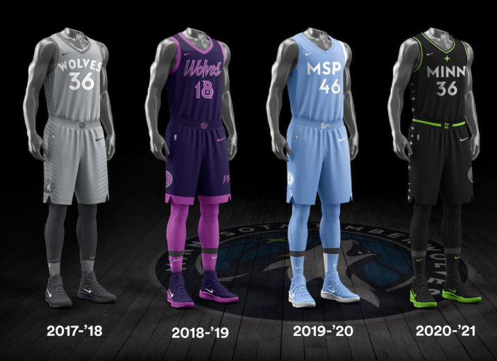
MINNESOTA TIMBERWOLVES
The Timberwolves go back to black for the 20-21 season. With the simple “MINN” across the chest and their trademark green as accents. Nothing earth shattering here, but a good look. Let’s face it, they did out do themselves in 2018-19 with their Prince inspired jerseys. His purple highness is a tough act to follow.
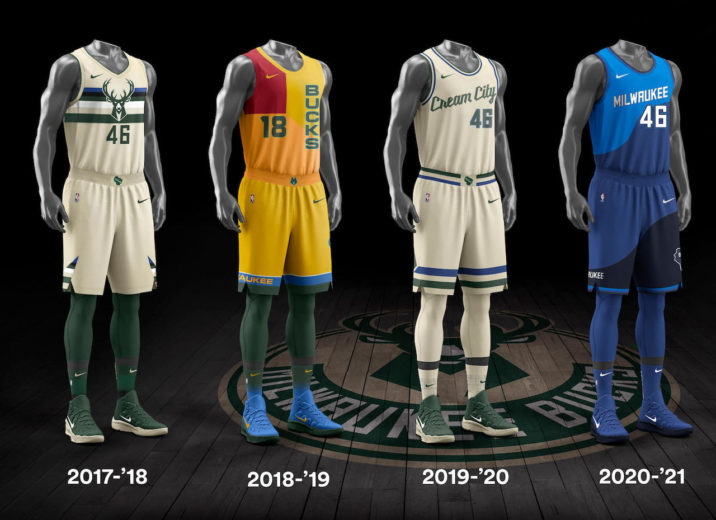
MILWAUKEE BUCKS
While you should still “Fear the Dear”, you don’t have to worry about seeing it on their jerseys. This year the Bucks leave behind the cream-colored jerseys of years past and opt for two tone blue. Also gone are the “Cream City” phrase and prominence of Bucks logo. Opting for a more straightforward “Milwaukee”.
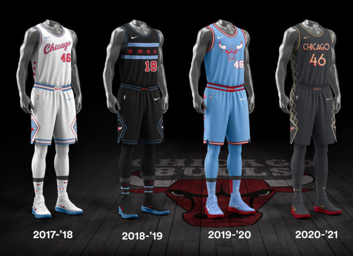
CHICAGO BULLS
Also in the drastic departure department are the Chicago Bulls. But in a meaningful way. Gone is the crimson red and white. Less pronounced is the Bulls logo. In 20-21 NBA City Edition jersey the Bulls borrow the logo from the marquee Chicago theatre – a city landmark. They also opt for matte black.
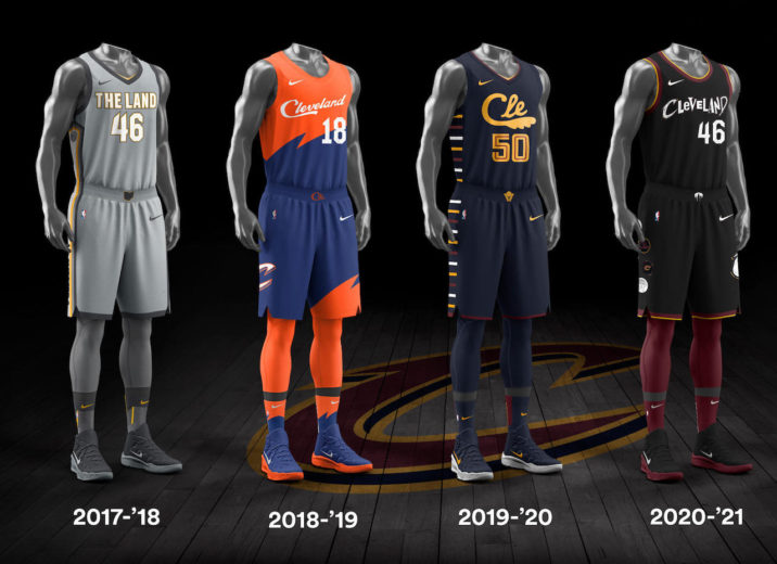
CLEVELAND CAVALIERS
Cleveland got creative this year. Leaving behind “The Land” moniker and returning to simply “Cleveland”. On the surface simple change. Yet, look close enough and you’ll notice clever design. Since Cleveland is the home of the Rock & Roll Hall of Fame, the team uses the fonts and letters from eight famous bands and artists such as Led Zeppelin, David Bowie, Nirvana, and others to spell out “Cleveland” across the chest of their jerseys. Well played, sir.
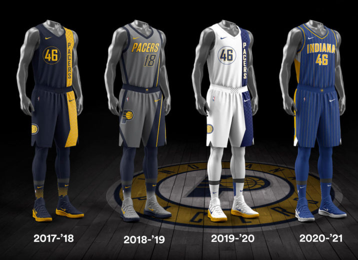
INDIANA PACERS
Basketball is taken seriously in the Hoosier state. So, it’s no surprise that the Indiana Pacers are taking a business-like approach to their NBA City Edition uniforms. Returning to one of their most iconic looks, the Pacers bring back the gold pinstripes set against a navy-blue base for 2020-21.
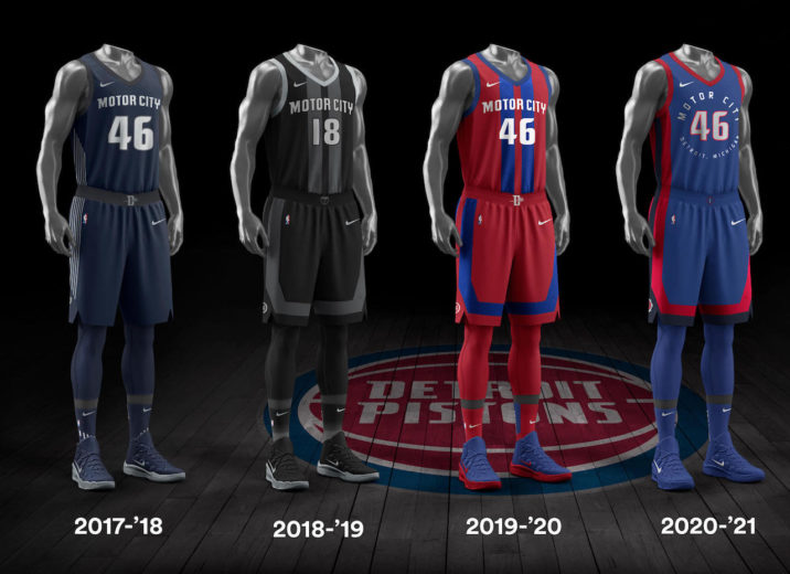
DETROIT PISTONS
The Pistons stick with their “Motor City” slogan but change the color scheme. Opting for dark blue with red trim. The team has been consistent with the look and feel of the City Edition jersey since day one. Yet, given the rich history of the region, from Motown, Joe Louis and Ford Motors, feels like they could do more here.
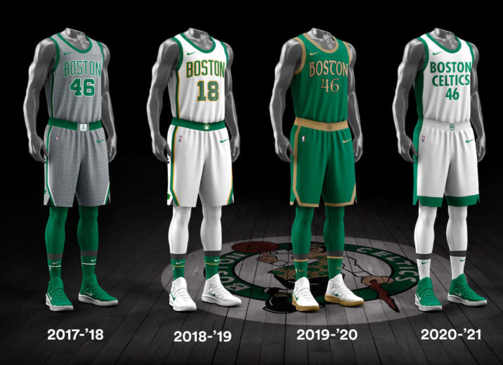
BOSTON CELTICS
This year the Celtics ditched the primary green and Gaelic font and get creative. Opting for primary white with green lettering. On the surface it may not seem like much, but the jersey is intended to emulate the 2008 Championship Banner.
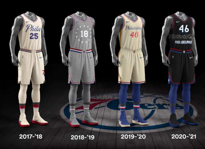
PHILADELPHIA 76’rs
The Sixers bring back the black jerseys that were a part of their Finals run in and the AI era in 2001. Also, on the jersey is the city’s iconic Boathouse Row outline.
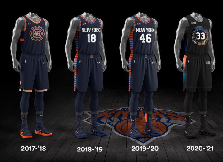
NEW YORK KNICKS
The New York Knicks also go to black as the primary color – although unlike the Sixer’s there is no championship run to lean on. The famous blue and orange adorn the side a trim and “The City That Never Sleeps” serves as the logo. A nod to the New York City. An improvement over years past.
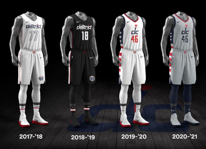
WASHINGTON WIZARDS
The Wizards stay consistent with their 2019-20 NBA City Edition look. Keep the logo and stars and stripes accents. Simply changing the primary color from white to grey.
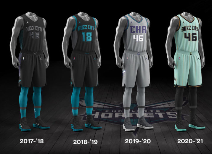
CHARLOTTE HORNETS
The Hornets use a great combination of old, new and homage to their city in their 20-21 NBA City Edition jersey. This year the foundation of the jersey is mint green and pinstripes – something old. Then go back to the “Buzz City” slogan – something new. And in honor of Charlotte being the second largest banking center in the United States, and the ridged trim and pinstripes represent the edge of a coin.
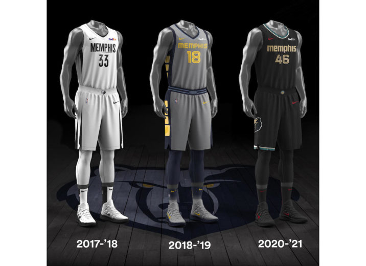
MEMPHIS GRIZZLIES
Now talk about digging into your city’s history. The Memphis Grizzlies aren’t playing around. The team pays tribute to Memphis native, Isaac Hayes. The singer/songwriter, best known for his Oscar and Grammy-winning theme song from the movie Shaft and his label Stax Records. The jersey contains alternating striping which is meant to represent the grooves found on the Stax’s vinyl records and include the Stax logo as part of the design.
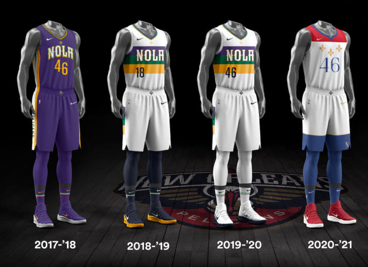
NEW ORLEANS PELICANS
The Pelicans leave behind the purple, gold and green color combo the region is famous for and opt for a more subdued red, white and blue look. But they still give a nod to their hometown by including the city’s symbol, the fleur-de-lis
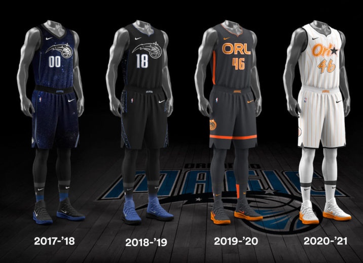
ORLANDO MAGIC
The Orlando Magic unveil a combination of old and new with their NBA City Edition jerseys. The design harkens back to the franchise early years, incorporating the pinstripes and logo from their team’s inaugural season. The Magic go new with choice of color. Using a golden orange. Perhaps a nod to the Sunshine State?
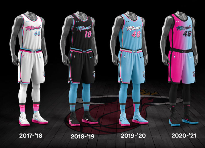
MIAMI HEAT
Only a franchise like the Miami Heat can pull this look off. Only in Miami folks. The Heat tap into their pastel roots of their region. Going with a two-tone sky blue and flamingo pink blend. Only in Miami folks!